Grunge TrueType font, personal-use download for distressed headlines
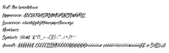
The Breakdown from The Breakdown is a grunge-style typeface designed to give digital and print projects a raw, eroded look for high-impact display text. It renders heavily distressed letterforms and textured glyph surfaces that emphasize a worn or decayed aesthetic. The font targets designers and creative hobbyists who need an immediate, gritty headline treatment without manual distressing; it suits posters, album art, and bold social posts where texture and presence matter.
How the Breakdown alters headline presence
The Breakdown transforms plain headlines into a weathered, industrial focal point by applying heavy erosion and high-detail texture inside individual letterforms. The result emphasizes surface damage and irregular edges, which creates a pronounced visual texture at display sizes. Typical use cases include large-format graphics such as posters, album covers, and bold social-media art that benefit from an intentionally degraded typographic voice.
What character support and file format the font provides
The font supplies a standard Latin set with display-focused glyphs, including uppercase and lowercase letters plus a basic set of numbers and punctuation styled to match the distressed alphabet. The file ships as a TrueType Font (.ttf), which ensures compatibility with most desktop design and word-processing applications, and preserves the detailed glyph textures when used in high-resolution artwork.
How simple it is to install and add to a workflow
Installation follows a straightforward ZIP-extract-and-install routine: download the archive from the hosting page, extract the contents, then right-click the .ttf file and choose Install. The font is hosted on the Dafont platform by the developer, so adding it to a project is the same as installing any other desktop font; once installed, the typeface appears in application font lists for immediate use.
How it fits into design pipelines and public reception
The Breakdown occupies a niche for gritty display work and is well received in its category on its host platform, where users favor its authentic "trash" or grunge styling. Because the design emphasizes surface detail, it performs best at larger sizes where texture reads clearly; at smaller point sizes the erosion can reduce legibility, so designers often reserve it for headlines and layered compositing rather than body text.
A focused choice for designers needing ready-made grunge headlines
Breakdown is a targeted option for creators who want an immediate distressed display face that adds gritty texture without manual finishing. It suits projects that place type at large scale; a practical tip is to pair it with a neutral sans or slab for supporting copy to preserve readability. Check licensing terms on the hosting page before using the font in commercial work.
Pros
High-detail eroded glyph textures for instant grunge impact
Includes uppercase, lowercase, numbers and punctuation matching the style
Supplied as a TrueType (.ttf) file for broad application compatibility
Cons
Licensed as personal-use on the host site; commercial rights require author permission
Heavy distressing reduces legibility at small sizes
Laws concerning the use of this software vary from country to country. We do not encourage or condone the use of this program if it is in violation of these laws. Softonic may receive a referral fee if you click or buy any of the products featured here.